The project
A fashion website has two jobs: communicate the brand and help people browse the products. SPIORRE's considered ready-to-wear identity called for a restrained visual approach, with collection photography and clear navigation doing the work rather than a crowded promotional layout.
Our role and scope
CH Digital's work covered the storefront's design and development, collection presentation and responsive shopping interface. The project uses Next.js, Tailwind and Vercel. This case study covers the visible storefront; it does not claim independently measured checkout or sales improvements.
- Next.js
- Tailwind
- Vercel
Design decisions and why they matter
Keep the brand visible while people shop
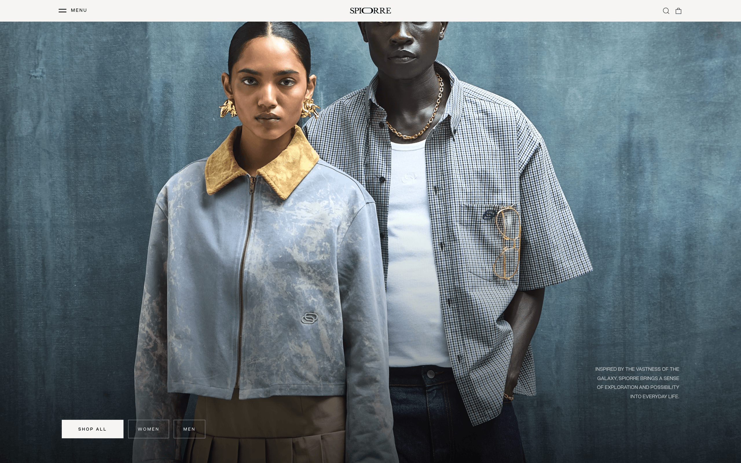
Typography, spacing and imagery create an editorial feel without hiding the route to the catalogue. The first impression and the shopping navigation share the same design language.
Separate collection entry points
Clear routes into women's and men's collections help visitors choose where to start. Collection-led navigation gives the imagery a useful destination instead of leaving the homepage as a purely visual introduction.
Carry the hierarchy onto smaller screens
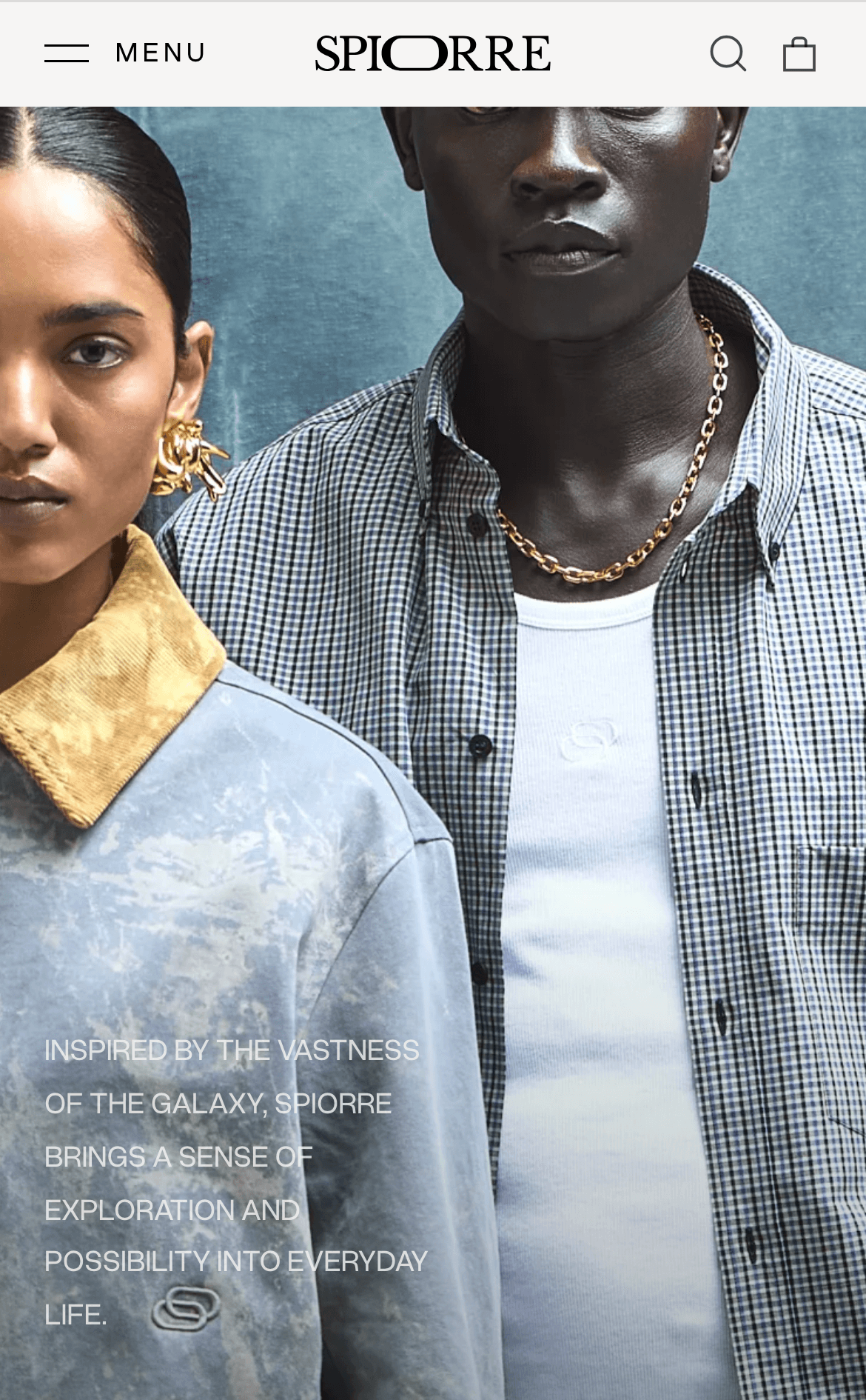
The responsive storefront keeps collection headings, imagery and navigation readable on a phone. The desktop and mobile screenshots show how the same brand presentation is adapted rather than simply shrunk.
What was delivered
- Brand-led storefront design
- Women's and men's collection navigation
- Collection storytelling and photography layouts
- Responsive ecommerce interface
This case study describes the delivered website. No independently verified before-and-after enquiry, traffic or sales figures are published here.